

NSW Department of Education
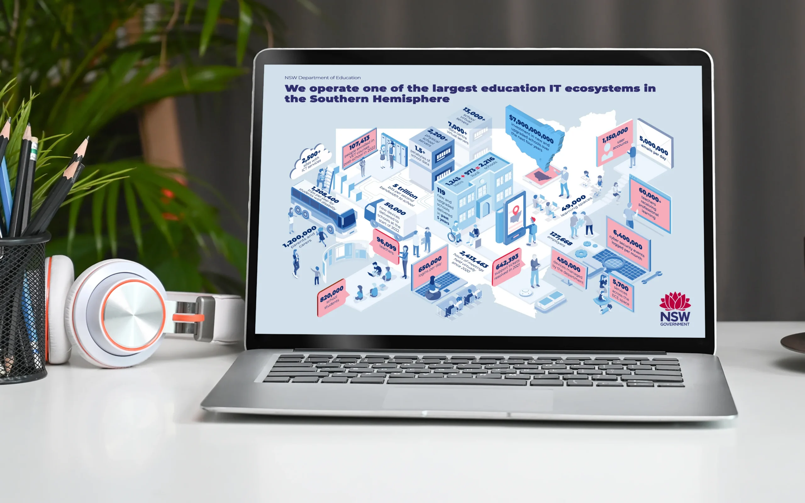
Key statistics infographics and data visualisation diagrams for a government digital strategy - making complex policy data clear, accessible and compelling for all audiences.
The Challenge
Government strategy documents are dense by nature. The NSW Department of Education’s Digital Strategy 2026-2030 was no exception: a far-reaching plan packed with data, statistics, and complex systems that needed to land clearly with a wide range of audiences.
The brief was to translate all of that into something people could actually absorb. A stat-heavy infographic to carry key figures, infographic explainers to break down complex systems, and a series of visual diagrams, all within strict Department of Education and NSW Government brand guidelines.
The challenge was not the volume of information. It was making that volume feel manageable without losing any of the rigour behind it.
Our Approach
When information is dense and the risk of visual overwhelm is real, the solution is not to simplify what is there. It is to find the right visual language to carry it.
We chose isometric-style graphics as the primary approach. Isometric illustration lets complex systems and layered information sit cleanly in one frame, separates information spatially, and makes abstract systems feel tangible.
For a strategy with multiple interconnected components, this clarity mattered. The visuals carried explanatory load so readers were not overwhelmed before they had started.
Every design decision stayed within DOE and NSW Government brand framework requirements.
The Solution
A suite of visual communications designed to make the Digital Strategy 2026-2030 accessible to its full audience.
The key statistics infographic structured data so the numbers told the story rather than being buried in it. Isometric explainers mapped complex systems and digital classroom components into clear visual narratives without stripping out detail.
All outputs were delivered in compliance with NSW Government brand guidelines.

Outcomes
Outcomes detail is pending final client publishing and usage confirmation.
Accessibility & Lived Experience
Accessibility was addressed through reading order, hierarchy, contrast, and language-light visual sequencing so materials stayed inclusive at high information density.
The approach centred how real teams consume policy communication under time pressure, not ideal review conditions.

Services Demonstrated
- Information Design
- Data Visualisation
- Visual Communication
- Infographic Design
- Government Brand Compliance